


Have you ever tried to make your apps look good in both landscape and portrait orientation? Wasn’t it frustrating to make views for both landscape and portrait separately? Is making screen layouts that support both the iPhone and iPad driving you crazy?
If yes, I bring you some good practices to overcome all hurdles for building a UI that supports everything from orientation to different screen sizes.
Not only does Autolayout make it easy to support different screen sizes in your apps, as a bonus it also makes internationalization almost trivial. You no longer have to make new nibs or storyboards for every language that you wish to support, and this includes right-to-left languages such as Hebrew or Arabic.
In this Autolayout tutorial you’ll learn about:
- Supporting apps in both portrait and landscape orientation
- Supporting apps for both iPhones and iPads
- Learning how to use constraints to layout your views
- Use size classes to present view elements at different coordinates
- Use Stack views to make your life easier in laying out complex UI
Our sample application
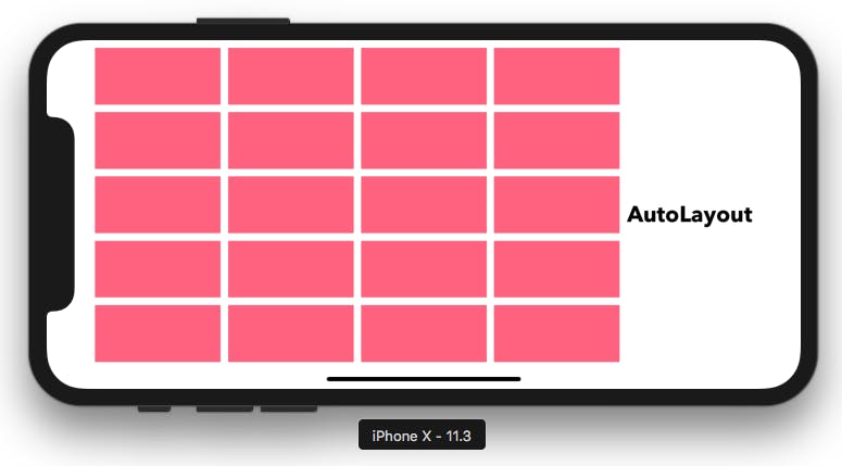
Figure 1 — View in landscape mode ( iPhone X )
Figure 2 — View in portrait mode ( iPhone X )
Figure 1 & 2 shows the sample application that we’re going to build throughout this tutorial. This application supports both landscape and portrait orientation as well as is built keeping in mind screen sizes for both iPhones and iPads.
Basics of Auto layout
The Pin menu It is present at the bottom right corner of the editor and is used to add constraints to different view elements such as labels, buttons, text fields. These constraints are nothing but relation between different view boundaries. Constraints can be fixed and also can be altered at run time for animation purposes.
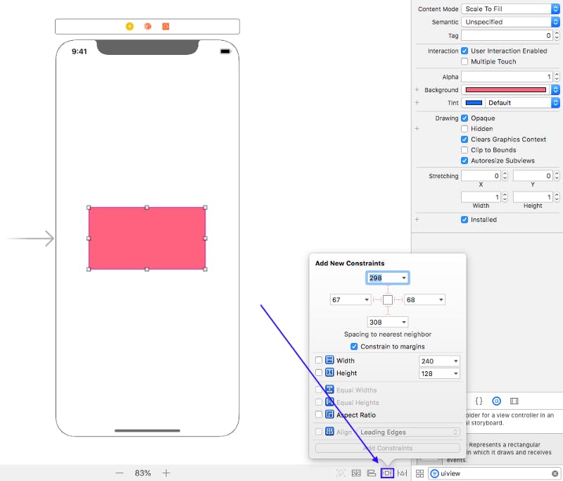
Figure 3 — Pin menu
The Align menu It is present just left of the pin menu and can be used to align views in the centre horizontally and vertically.
Figure 4 — Align menu
Document outline This is present on the left side of the editor and can be used to view hierarchy of views and also to see all the constraints added inside a particular view controller.

Figure 5 — Document Outline
Attributes inspector This is used to customise the view attributes such as it’s background colour and font.
Attributes inspector
Laying out our views
We’ll first start by adding a single view to the view controller and adding constraints to it. Search for a UIView inside the Object Library and drag it inside the view controller. Add whatever colour you like and add constraints so that the view sticks to the top left corner of the screen.
Select the view and open the pin menu and use this set of constraints:
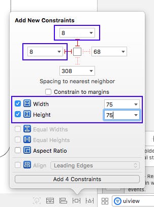
Figure 7 — Adding constraints to a view
Figure 7 shows that the height and width of the view is equal to 75 and the top anchor and left anchor is set to 8 which basically means no matter it is an iPhone or an iPad, or device is landscape or portrait the view will always have distance 8 from top and left corner of the view controller. This is how our view controller looks like after adding these constraints.
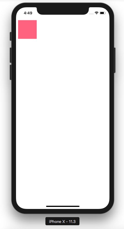
Figure 8 — Sample application
It seems pretty easy to add views and add constraints to it, right? But you should always remember programming is not about repeating the same steps again and again. Let us assume that we’re building the UI in the way we just did. There are total 20 rectangles in our view controller and for every view we’ll have to add constraints keeping in mind the relation between each and every view that is touching the boundary of a particular view. This is a very long and tedious task, instead we should find an easy way to add these 20 rectangles or as many as we want in an efficient and scalable way. By scalable I simply mean if let’s say in future we want to double the number of rectangles then it should be done without modifying any constraints. Now you must be figuring out how should we achieve this? Well, Apple has a very nice solution to our problem Stack Views.
Stack view as the name suggest is a stack which can be horizontal or vertical and it contains any number of view inside it. The main advantage of stack view is that sometimes you don’t even have to add constraints to its child views, it automatically manages all that by setting some attributes. Let’s start by creating views using stack view.
Quick Tip — Select a view and drag it while holding the option key to make a copy of it (it also copies constraints added to the view).
First, remove all the constraints that we’ve added to the rectangular view, you can do that in the document outline or from the size inspector which is just right of the attributes inspector. Now create 4 more copies of the rectangular view by using the option key trick. Your view controller should be like this:
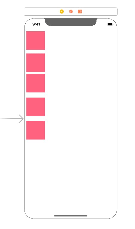
Figure 9 — View controller after copying views
Now select all the 5 view by holding the command key and selecting the views and then make 3 more copies. Your view controller should now have 20 rectangles as required in the sample application. Make sure there are no constraints added to any view at this point. Here is how you view controller should look like:
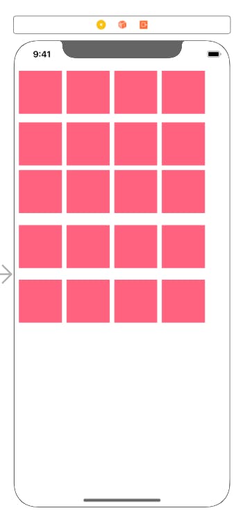
Figure 10 — Rectangle without any constraints
Let’s add a label at the bottom and add some constraints and attributes to it. Here are the attributes that I’ve added followed by the constraints on the label.

Figure 11 — Attributes for the label
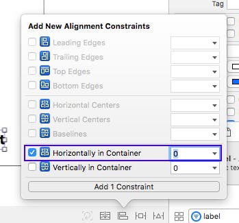
Figure 12 — Centre aligning the label horizontally
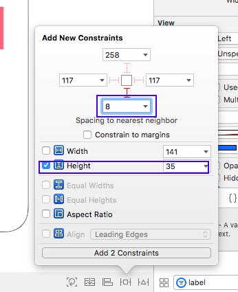
Figure 13 — Adding bottom and height constraint
Our work for the label is done, let’s start adding our rectangular views to stack. What we’re going to do is create 5 stack views:
- One stack view for each vertical row — Total 4 stack view
- One stack view for other four stack view
Select the first vertical row and add to stack view and add some attributes to it. Here are the options that I’ve selected.
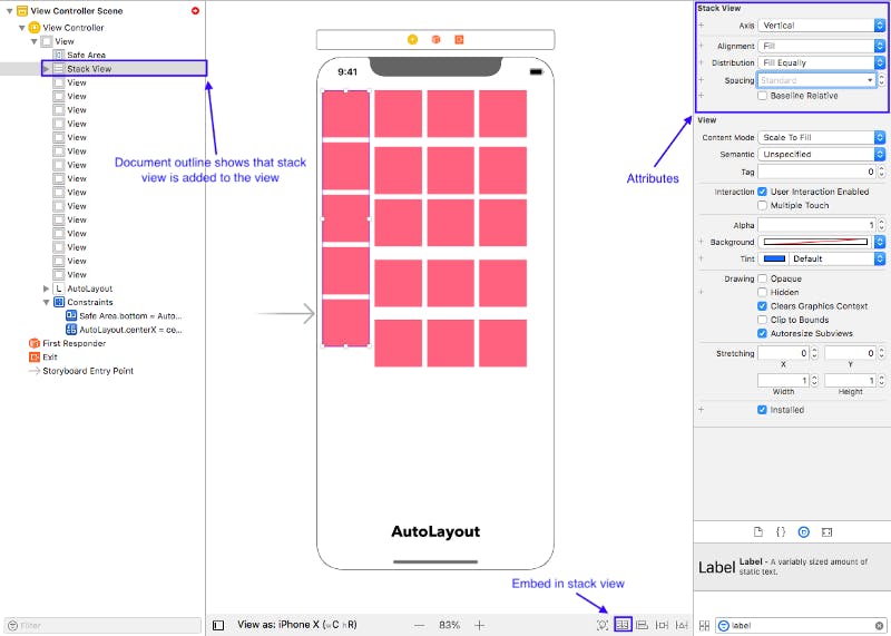
Figure 14 — Our first stack vertical stack view
Let us understand the attributes that we’ve added to the stack view.
- Axis — This can be either vertical or horizontal
- Distribution — Fill equally (it gives equal space to every child view). Make sure to try different options available to see the difference between them.
- Spacing — I’ve used standard spacing. It gives spacing between child views. You can use any integer value.
Now let’s create 3 more stack views in the similar manner and our document outline should look like this. Make sure to follow the same steps that we’ve used to create the vertical stack.
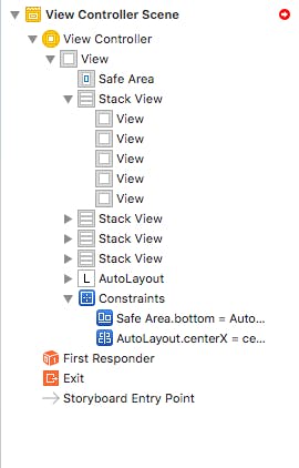
Figure 15 — Document outline after 4 stack views
So we have successfully created 4 stack view. Now let’s create the last stack view which will hold the other 4 stack views. This stack view will be different as it will hold other 4 stack views and the axis will be horizontal. Let’s try to do it by yourself and this is how the document outline should look like after adding the last stack view.
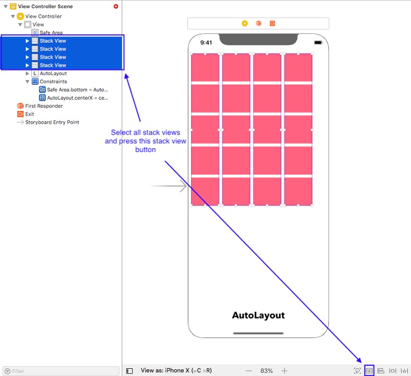
Figure 16 — Creating the final stack view
We’re done with creating all the stack view. Now is the time to add constraints to it so that it can automatically manage the size of it’s child view and also will support both portrait and landscape orientation. Select the topmost stack view and add constraints to it. We will use the top anchor to constraint it to the top. Left and right anchor with the left and right side of the view and bottom anchor will be to the top of the label.
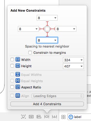
Figure 17 — Constraints for the topmost stack view
Let’s build and run the app, it should look like this in portrait and landscape orientation.
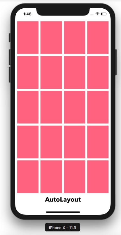
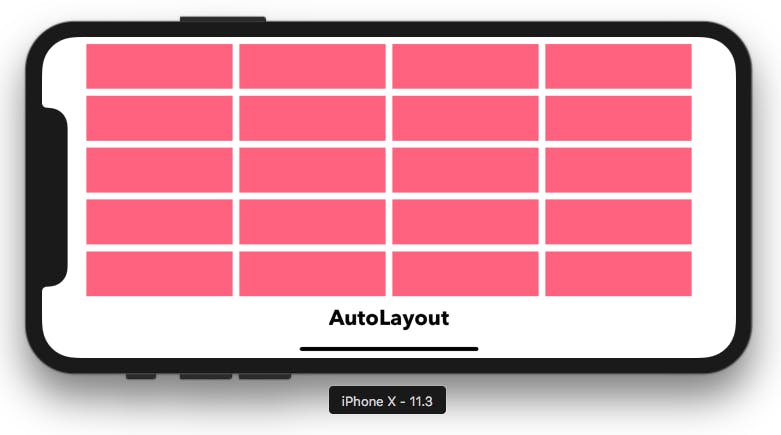
Figure 18 & 19 — Application after using stack views
We’ve successfully used AutoLayout to create 20 rectangular views in no time. If we talk about scalability you can simply create a new stack and add it to our stack view and it will automatically add it to the view controller and manage all its constraints for both portrait and landscape orientations as well as for iPhones and iPads.
Now let’s try to improve the UI of our app. In portrait orientation you’ll notice that the views are stretched and we don’t want it to look like this. This is looking somewhat okay in iPhones but if we use iPad this is definitely not the UI that we would want to build. We can do this by using size classes. Let’s understand what size classes are and how they can help us to build UI easily to support different devices and orientations.
Introduction to size classes
Instead of creating views separately for different orientations of iPhones and iPads, Apple has laid out two different size classes on the basis of height and width of the device. Developers can use them to lay out their content. This ensures that for a particular size class user has same experience whether he/she is using iPhone or an iPad. Let’s get into some detail about how Apple has divided the size classes. There are two size classes i.e Compact and Regular. So basically it could be of different combinations like this:
- iPhone
a) All iPhones in portrait are compact in width and regular in height.
b) All non plus iPhones in landscape are compact in both dimensions - iPhone plus
a) iPhone plus is also compact in width and regular in height in portrait.
b) But in landscape, the iPhone plus is compact in height and regular in width - iPad
a) Always regular in both dimensions
b) But depending on the environment an MVC (Master View Controller) is in, it might be compact ( e.g split view master )
Here is the figure that illustrates above points about size classes.
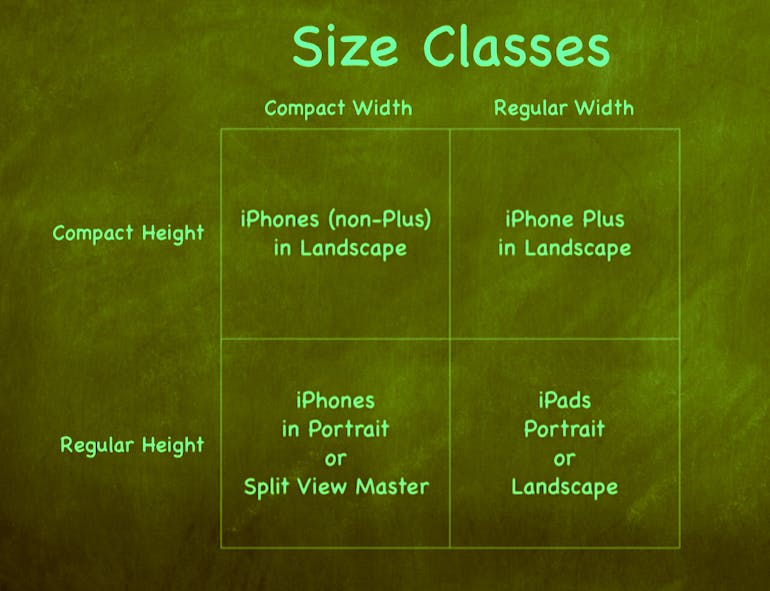
Figure 20 — Size Classes
Let’s understand how we can use size classes to change the user experience according to the devices they are using.

Figure 21 — Size classes in Xcode
You can use any device that you want to use and hit ‘vary for Traits’. It will ask you two option i.e height or width. You can select both or any one of them but in our case we only want to vary it for different height, we don’t care about the width of the device. Select height and hit vary for traits again. The bottom panel will change its colour and will look like this.
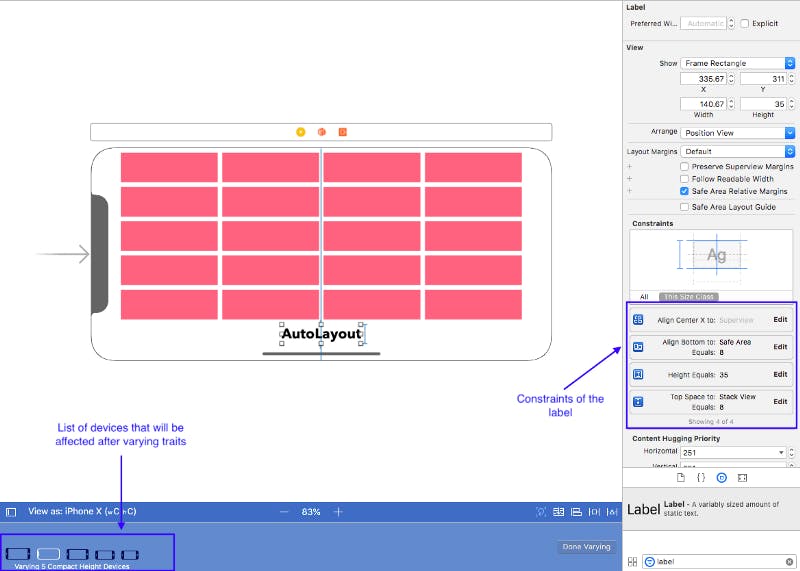
Fig 22 — Varying trait collection
You’ll see the list of all the devices and orientation that will get affected after you’re done varying. You can select those devices and have a look at the UI whenever you want to. In the right panel you will see the four constraints that we have used for the label ( 3 for the label and the view, 1 between the label and the topmost stack view ). Delete all those constraints by selecting them and hitting the delete button.
Don’t worry this will not delete the constraints for the label, this will only delete for this particular size class i.e when height is compact. Now add new constraints for the label so that it is in the right side of the stack view. Also change the bottom constraint of the stack view so that it anchors to the bottom if the view’s safe area. Here are the constraints that should be added.
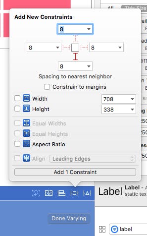
Fig 23 — Anchor stack view bottom to view’s safe area bottom
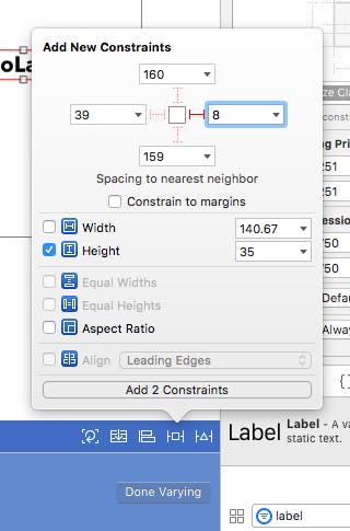
Fig 24 — Fix label’s height and add right anchor to it
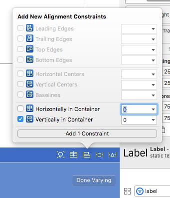
Fig 25 — Vertically center the label in the view
Now you’ll just have to add one more constraint i.e the spacing between the stack view’s right side and the label’s left side. I’ve kept that spacing to be 8. You can choose whatever value you want it to. Remember we haven’t choose any fixed width for the label, what it does is it will automatically resize the label and the stack view width according to the text inside the label.
Build and run the app and it should look like this in different devices and orientations.
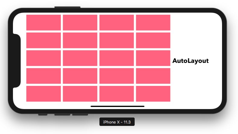
Fig 26 — iPhone X landscape mode
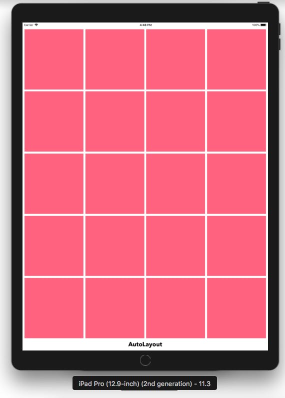
Fig 27 — iPad Pro portrait mode

Fig 28 — iPad Pro landscape mode
Summary
Here comes the end of this tutorial. We have learnt about how to use AutoLayout with Stack view to reduce our time and use size classes to vary user experience according to varied screen sizes and orientations.